The Challenge
Mobile trading was one of the most requested features from advisors and a common point of feedback in App Store reviews.
As the sole designer on the product team, I worked closely with product managers, business analysts, systems analysts, and engineers to bring trading to mobile. I also collaborated with designers across Fidelity to ensure the experience aligned with broader platform standards.
A previous mobile trading experience had been deprecated, creating an opportunity to rethink how trading could fit into modern advisor workflows.
Before mobile trading, advisors would either call their home office to place a trade or make a note to handle it later when they returned to their desk.
The need for mobile trading was clear, but designing the experience was more nuanced than simply bringing a desktop workflow onto a phone.
Trading workflows rely on a large amount of information, and many of the inputs are dependent on the selections that come before them. The type of trade, account, or order being placed could change what information needed to be displayed and what actions were available to the user.
This created an interesting design challenge. We needed to support a range of trading scenarios while keeping the experience approachable and ensuring advisors always understood what information was needed next.

Research & Insights
Going into research, it was easy to assume that users wanted the same trading capabilities they had on desktop.
As we spoke with advisors, it became clear that wasn’t necessarily the case.
While mobile trading was consistently one of the most requested features, many advisors still preferred completing more complex trades at their desks where they had access to additional information and a larger workspace.
What they wanted was flexibility.
They wanted the ability to respond to client conversations, place straightforward trades, and take action when they weren’t sitting in front of their workstation.
That insight helped us focus on the scenarios where mobile trading could provide the most value rather than trying to recreate the entire desktop experience.
Establishing scalable interaction patterns across Wealthscape
As the sole designer, I was responsible for the end-to-end experience from research and workflow definition through interaction design and testing.
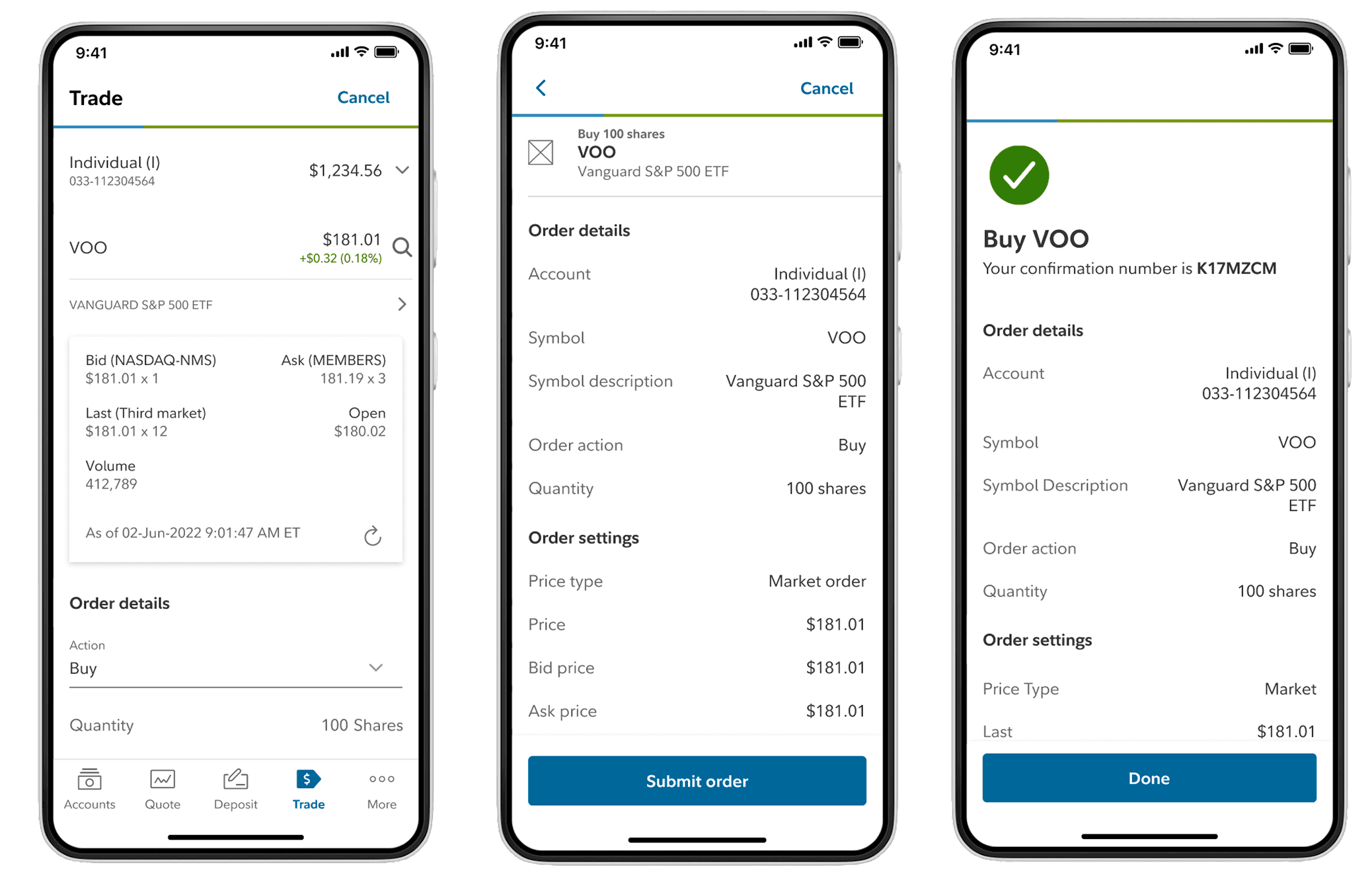
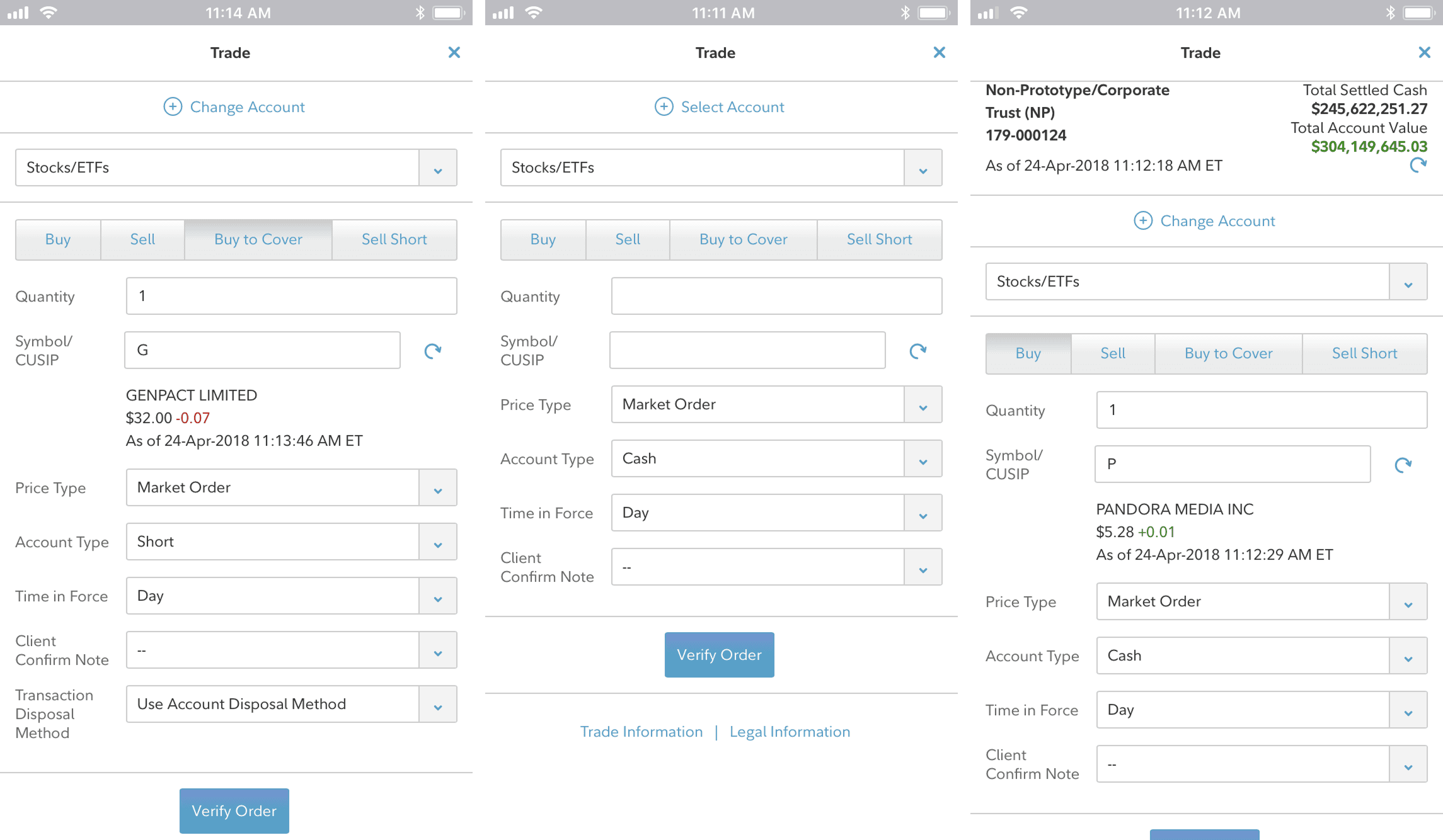
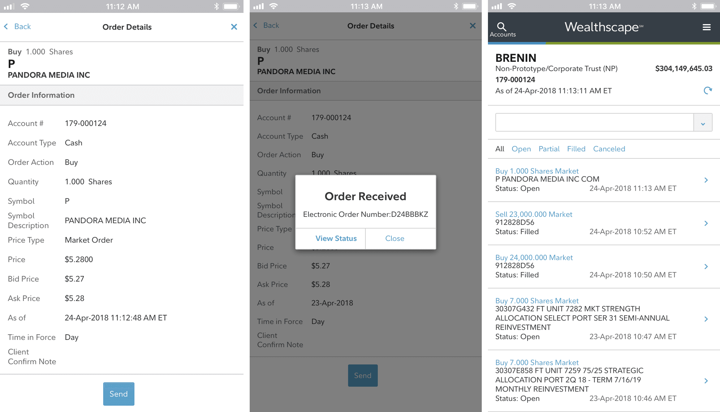
One of the biggest design challenges was balancing information density with workflow complexity.
Trading decisions rely on a large amount of real-time data, but the challenge went beyond fitting information onto a smaller screen. Many of the inputs throughout the trading process were dependent on previous selections. Depending on the account, security, or order type, different fields, options, and requirements needed to be presented to the user.
This required careful consideration of both hierarchy and flow. Users needed access to the right information at the right moment without being overwhelmed by information that wasn’t relevant to their specific trading scenario.
Rather than exposing every possible option upfront, the experience was designed to progressively reveal information as users moved through the workflow while maintaining transparency around what was required next.
One area I spent considerable time refining was the Security Quote experience, which became a critical touchpoint for helping advisors quickly evaluate securities before placing a trade.
Impact & Reflection
One of the most interesting takeaways from this project was seeing how context influences user behavior.
Going into research, it would have been easy to assume that users wanted the full desktop trading experience available on mobile. Instead, we found that many advisors viewed mobile as a way to stay responsive and handle straightforward tasks while away from their desks.
That understanding helped us focus on the workflows that mattered most in a mobile environment and informed many of the prioritization decisions throughout the project.
Looking back, this project reinforced the importance of understanding not just what users are asking for, but how they expect to use it. The goal wasn’t to recreate desktop trading on a smaller screen. It was to create a mobile experience that fit naturally into the way advisors already worked.
The Challenge
Mobile trading was one of the most requested features from advisors and a common point of feedback in App Store reviews.
As the sole designer on the product team, I worked closely with product managers, business analysts, systems analysts, and engineers to bring trading to mobile. I also collaborated with designers across Fidelity to ensure the experience aligned with broader platform standards.
A previous mobile trading experience had been deprecated, creating an opportunity to rethink how trading could fit into modern advisor workflows.
Before mobile trading, advisors would either call their home office to place a trade or make a note to handle it later when they returned to their desk.
The need for mobile trading was clear, but designing the experience was more nuanced than simply bringing a desktop workflow onto a phone.
Trading workflows rely on a large amount of information, and many of the inputs are dependent on the selections that come before them. The type of trade, account, or order being placed could change what information needed to be displayed and what actions were available to the user.
This created an interesting design challenge. We needed to support a range of trading scenarios while keeping the experience approachable and ensuring advisors always understood what information was needed next.
Research & Insights
Going into research, it was easy to assume that users wanted the same trading capabilities they had on desktop.
As we spoke with advisors, it became clear that wasn’t necessarily the case.
While mobile trading was consistently one of the most requested features, many advisors still preferred completing more complex trades at their desks where they had access to additional information and a larger workspace.
What they wanted was flexibility.
They wanted the ability to respond to client conversations, place straightforward trades, and take action when they weren’t sitting in front of their workstation.
That insight helped us focus on the scenarios where mobile trading could provide the most value rather than trying to recreate the entire desktop experience.
Establishing scalable interaction patterns across Wealthscape
As the sole designer, I was responsible for the end-to-end experience from research and workflow definition through interaction design and testing.
One of the biggest design challenges was balancing information density with workflow complexity.
Trading decisions rely on a large amount of real-time data, but the challenge went beyond fitting information onto a smaller screen. Many of the inputs throughout the trading process were dependent on previous selections. Depending on the account, security, or order type, different fields, options, and requirements needed to be presented to the user.
This required careful consideration of both hierarchy and flow. Users needed access to the right information at the right moment without being overwhelmed by information that wasn’t relevant to their specific trading scenario.
Rather than exposing every possible option upfront, the experience was designed to progressively reveal information as users moved through the workflow while maintaining transparency around what was required next.
One area I spent considerable time refining was the Security Quote experience, which became a critical touchpoint for helping advisors quickly evaluate securities before placing a trade.
Impact & Reflection
One of the most interesting takeaways from this project was seeing how context influences user behavior.
Going into research, it would have been easy to assume that users wanted the full desktop trading experience available on mobile. Instead, we found that many advisors viewed mobile as a way to stay responsive and handle straightforward tasks while away from their desks.
That understanding helped us focus on the workflows that mattered most in a mobile environment and informed many of the prioritization decisions throughout the project.
Looking back, this project reinforced the importance of understanding not just what users are asking for, but how they expect to use it. The goal wasn’t to recreate desktop trading on a smaller screen. It was to create a mobile experience that fit naturally into the way advisors already worked.
