Reimagining the Account Profile Experience
In the complex world of financial services, the Account Profile page is a critical touchpoint for advisors, operations associates, and client service teams. It’s where essential updates are made, client information is verified, and day-to-day account management tasks begin. Yet, despite its importance, the legacy experience is riddled with friction: excessive whitespace, unclear editing flows, and a lack of critical data fields often slowed users down and introduced risk.
In 2021, the team set out to reimagine the Account Profile experience from the ground up. Through iterative research, usability testing, and concept validation, they uncovered deep insights into how users navigate, update, and interact with account data. The goal was to create a more intuitive, efficient, and trustworthy experience—one that aligned with users’ mental models and supported both simple and complex workflows.
This case study outlines the evolution of the Account Profile redesign, from identifying the right problems to validating the right solutions. It highlights the research methods we used, the voices of our users, and the design decisions that shaped a more seamless and scalable experience.
-
Background & Problem
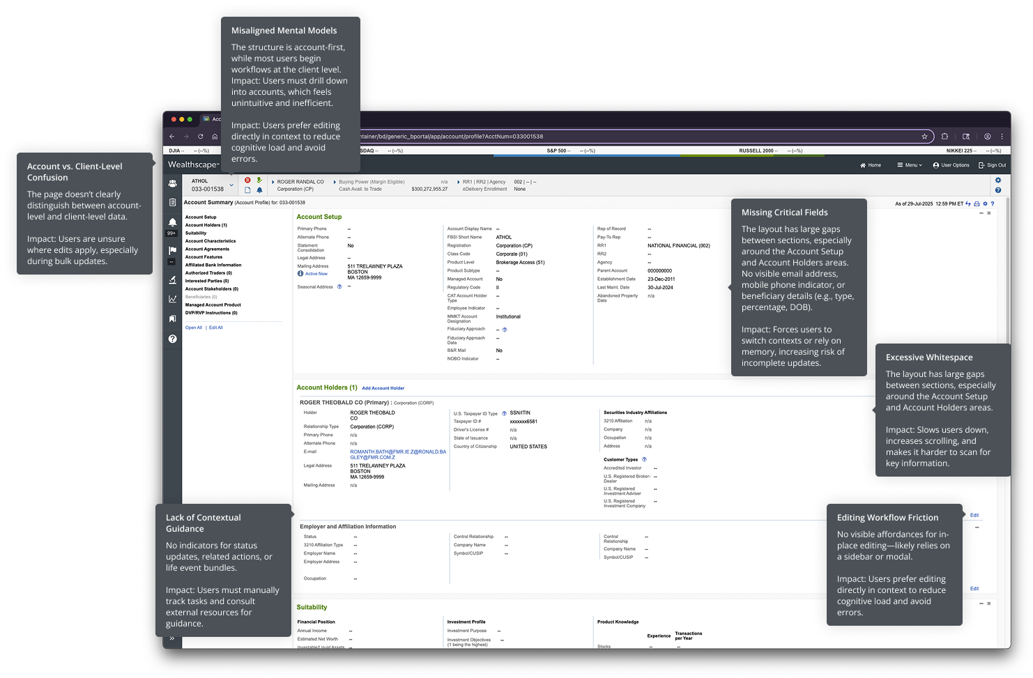
The legacy Account Profile experience in Wealthscape was functional but far from intuitive. Users, ranging from advisors to operations associates, reported that the interface was cluttered, slow to navigate, and lacked critical information. Common tasks like updating contact details or verifying beneficiaries required excessive scrolling, multiple clicks, and often led to errors or missed steps.
Key pain points included:
- Excessive whitespace and poor visual hierarchy
- Confusing editing workflows (sidebar vs. in-place)
- Missing essential fields (e.g., email, mobile type, beneficiary details)
- Lack of clarity between account-level and client-level data
- Low confidence in bulk editing functionality
These issues not only slowed users down but also introduced risk into high-stakes financial workflows.
-
Research Approach
To address these challenges, we conducted a multi-phase research initiative that included:
- Usability Testing (2021): Evaluated redesigned Account Profile prototypes with 9 participants across 7 sessions, including advisors and operations associates from both Custody and Clearing lines of business.
- Navigation Study (2024): Surveyed 141 users and interviewed 20 participants to understand broader navigation pain points across Wealthscape.
- Concept Testing (2024): Tested five new concepts for Account Maintenance workflows with 8 subject matter experts, including Fidelity employees and external users.
Each phase was designed to validate hypotheses, uncover usability issues, and align design decisions with real user needs.s.
Key Insights
Users crave clarity and efficiency
Whitespace overload and poor visual hierarchy made it difficult to scan and locate information quickly.
Users expressed frustration with excessive scrolling and unclear section boundaries, which increased cognitive load and the risk of errors.
“There really is an unbelievable amount of white space.”
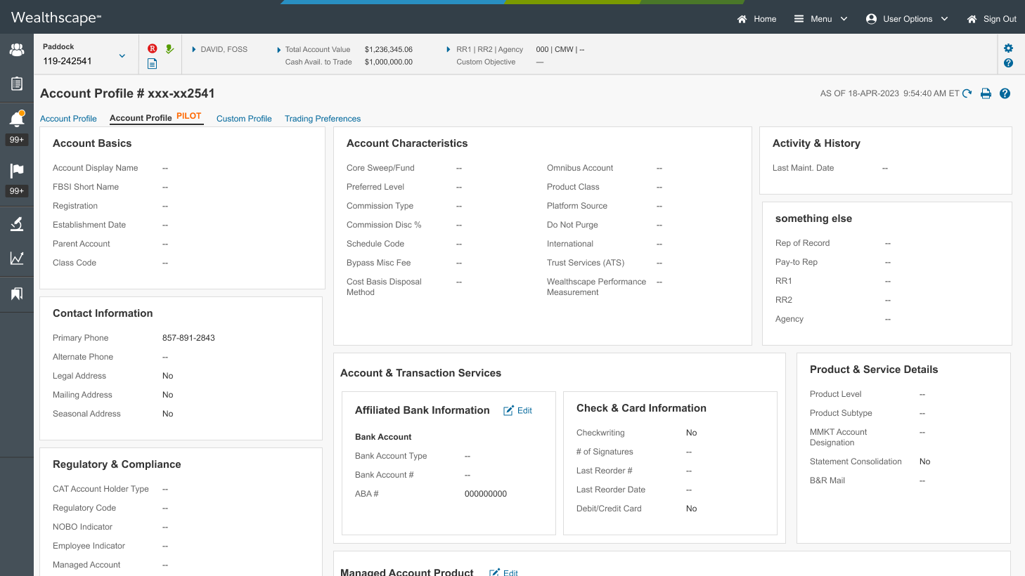
In-place editing outperformed sidebar editing
Participants overwhelmingly preferred in-place editing, which allowed them to stay focused and reduced the need to shift attention across the screen.
The sidebar editing model was seen as disruptive and confusing, especially when labels didn’t match or fields were hidden.
“The sidebar is just another place to look for information… it’s bound to lead to confusion.”
Users were unsure whether changes would apply at the account or client level, leading to hesitation and low confidence in the system.
The interface didn’t clearly communicate what would be updated or how changes would propagate across accounts.
Bulk editing lacked transparency
“I’m not exactly sure what we’re updating… like what field.”
Critical data fields were missing
Users expected to see email addresses, mobile phone indicators, and beneficiary details (e.g., type, percentage, DOB) directly on the profile.
The absence of these fields forced users to switch contexts or rely on memory, increasing the risk of incomplete updates.
“If you don’t know the birthday and what percent of the account is allocated… then we’re operating blind.”
Mental models matter
Across all studies, users emphasized the importance of aligning the interface with their mental models, whether they approached tasks by client, account, or household.
Most users began their workflows at the client level, reinforcing the need for a centralized, client-first view.
“Typically I’ll start at the client level… then I’ll go into a particular account.”
Across all studies, users expressed a desire for the system to guide them through complex or unfamiliar workflows, especially during life events like marriage or address changes.
Participants appreciated features like status indicators, life event bundles, and contextual flyouts that surfaced relevant actions and information without requiring them to dig through multiple screens.
There was also a strong desire for intelligent defaults, settings that remember user preferences or apply changes consistently across accounts.
Users want contextual guidance and intelligent defaults
“While I’m having the conversation with the client, I might remember the beneficiary, but I might forget the account access rights… this reminds me of all the things I probably want to take care of.”
A/B Testing Layouts
We will be conducting an A/B test to evaluate two layout approaches:
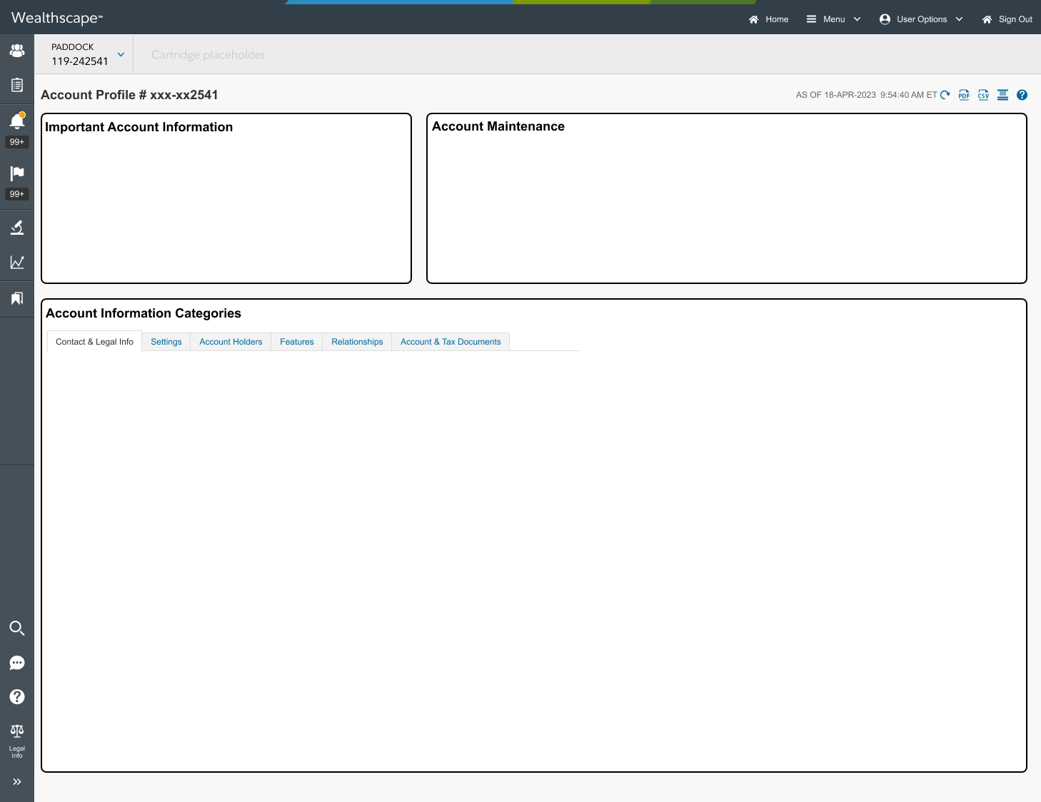
Single-page layout: Presents all account information in a continuous scroll.
Tabbed layout: Organizes content into discrete, navigable sections.
Goal: Identify which layout better supports usability, task efficiency, and user satisfaction across different personas.
-
Organizes content into discrete, navigable sections (e.g., Account Setup, Suitability, Beneficiaries, Contact Info).
Pros:
- Reduces visual clutter and cognitive load
- Allows users to focus on one task or data type at a time
- Easier to guide users through workflows section by sectionCons:
- Requires more clicks to access full account information
- May disrupt workflows that span multiple sections
- Risk of users missing information if tabs aren’t clearly labeled or prioritizedBest suited for: Investors and newer users who benefit from a simplified, guided experience
-
A continuous scroll experience that presents all account information on one page.
Pros:
- Easier to scan and search for information without switching tabs
- Supports quick reference workflows, especially for advisors who need to see everything at once
- Reduces navigation friction for users familiar with the legacy layoutCons:
- Can become overwhelming if too much data is presented at once
- Increases cognitive load for users who only need specific sections
- May require more scrolling, which was a known pain point in legacy designsBest suited for: Power users, advisors, and operations associates who prefer a holistic view
-
Combines the benefits of both approaches by using tabs for high-level navigation, with each tab containing scrollable subsections.Pros:
- Balances clarity and accessibility
- Allows users to jump to relevant sections while still seeing related data in context
- Supports both focused workflows and holistic reviewCons:
- Requires thoughtful design to avoid redundancy or confusion.
- May introduce complexity in responsive layouts or mobile viewsBest suited for: Mixed user groups and scalable design across personas

Advisor-Facing Design in Parallel
While the WSI pilot is underway, we’re designing the advisor-facing Account Profile—a more robust experience tailored to the needs of power users.
How WSI Informs Advisor Design
Shared layout patterns: Successful layout structures (e.g., tabbed navigation, in-place editing) from WSI can be adapted for advisors.
Content prioritization: Insights into what investors care about help advisors anticipate client questions and prepare accordingly.
Interaction models: Features like contextual flyouts, status indicators, and simplified editing can scale to advisor workflows with added depth.
Advisor-Specific Enhancements
Maintain access to deeper data and multi-account workflows
Support bulk editing, compliance visibility, and client-level navigation
Align with advisor mental models and task flows (e.g., suitability reviews, beneficiary updates)
Pilot Launch in WSI
(Investor View)
We’re piloting the redesigned Account Profile in Wealthscape Investor (WSI) to validate a simplified, user-centered experience for end investors.
Why WSI First?
Investors typically need less data and fewer workflows than advisors.
This audience benefits most from clarity, simplicity, and reduced cognitive load.
WSI provides a controlled environment to test layout, content hierarchy, and interaction patterns before scaling to more complex use cases.
Pilot Objectives
Test layout effectiveness: Validate whether a simplified single-page or tabbed layout improves comprehension.
Evaluate data reduction: Identify which data elements can be removed or deprioritized without impacting usability.
Gather behavioral insights: Understand how investors navigate, what they focus on, and where they get stuck.
Design Approach
Removed non-essential fields and legacy data
Prioritized readability and visual hierarchy
Introduced clearer sectioning and progressive disclosure

Section-by-Section Rollout
To manage complexity and reduce risk, we’re releasing the new Account Profile experience incrementally, one section at a time. This phased approach allows us to gather targeted feedback, validate design decisions in real-world use, and make iterative improvements before scaling.
We’re starting with the Suitability section, which serves as a testbed for:
Evaluating layout patterns (single-page vs. tabbed)
Testing in-place editing workflows
Refining data presentation and hierarchy
This modular rollout strategy ensures that each section is optimized for usability and aligned with user needs before full deployment.